Mastering Color Theory: A Comprehensive Guide

by thuthao541998

Introduction

When it comes to art, knowing about colors isn’t just luck. It’s a skill you can learn and get really good at. Some artists start with color combinations, but that’s not the main thing about color theory. The real deal is understanding how colors work together and where people look when they see them. This article will help you understand the basics of color theory and how to use it to make your art even better.

What is Color Theory?

Color theory is a set of rules and guidelines that help artists communicate to viewers how well different colors work together in an artwork. By using colors effectively, artists can influence the atmosphere of the piece, guiding viewers’ eyes to what is important and evoking certain emotions or feelings.

A. The Basics of Color Theory : Hue, Saturation, and Value.

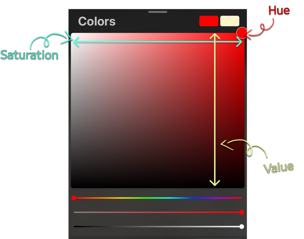
If you use Procreate like me you can easily see in the Colors section

Here’s how Hue, Saturation, and Value look like
Color Theory

1. Hue : The Color Wheel

Let’s start with the most obvious aspect of color: Hue. 

Hue refers to the actual pure color itself, such as red, blue, or green regardless of the brightness or anything

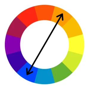
Hues can be organized into a color wheel Whats is the complementary colour for red? : r/AskPhotography

credit : Reddit

2. Value: The Lightness of Color

Value refers to the lightness or darkness of a color. It’s like the contrast knob on your TV – you can adjust it to make the image lighter or darker. Colors with high value are light and airy, while colors with low value are dark and rich.

credit : Elevate Your Art

3. Saturation: The Brightness of Color

Saturation refers to the brightness or intensity of a color. Think of it like the volume knob on your TV – you can turn it up or down to adjust the brightness of the image. Desaturated colors are muted and washed out, while highly saturated colors are bright and vibrant.

credit : Shotkit

B. The Basics of Color Theory : Cool and Warm

Warm colors are associated with heat and include red, orange, and yellow. These colors tend to be energizing and can create a feeling of excitement, movement, or passion. On the other hand, cool colors are associated with cold and night and include blue, green, and purple. These colors tend to be calming and can evoke feelings of peace or serenity, but they can also be associated with stillness, despair, and sadness.

Warm colors tend to be more advancing and vibrant, while cool colors tend to be more receding and relaxing. This means that warm colors can make an area feel closer and more intimate, while cool colors can create a sense of distance and make an area appear further away.

In addition to their temperature, colors can also have different moods and associations. For example, red is often associated with love and passion, while blue is associated with sadness and depression.

It’s also worth noting that the perceived temperature of a color can be affected by its surrounding colors and the light source. For example, a blue color may appear colder when surrounded by warm red, and a yellow may appear warmer in the sun than in the shade.

C. Color Harmony

Before beginning to paint your artwork, it’s always helpful to think about what colours you could use. This is where the colour wheel comes in handy. You can use these groups of colors for your art

1. Monochromatic Colours

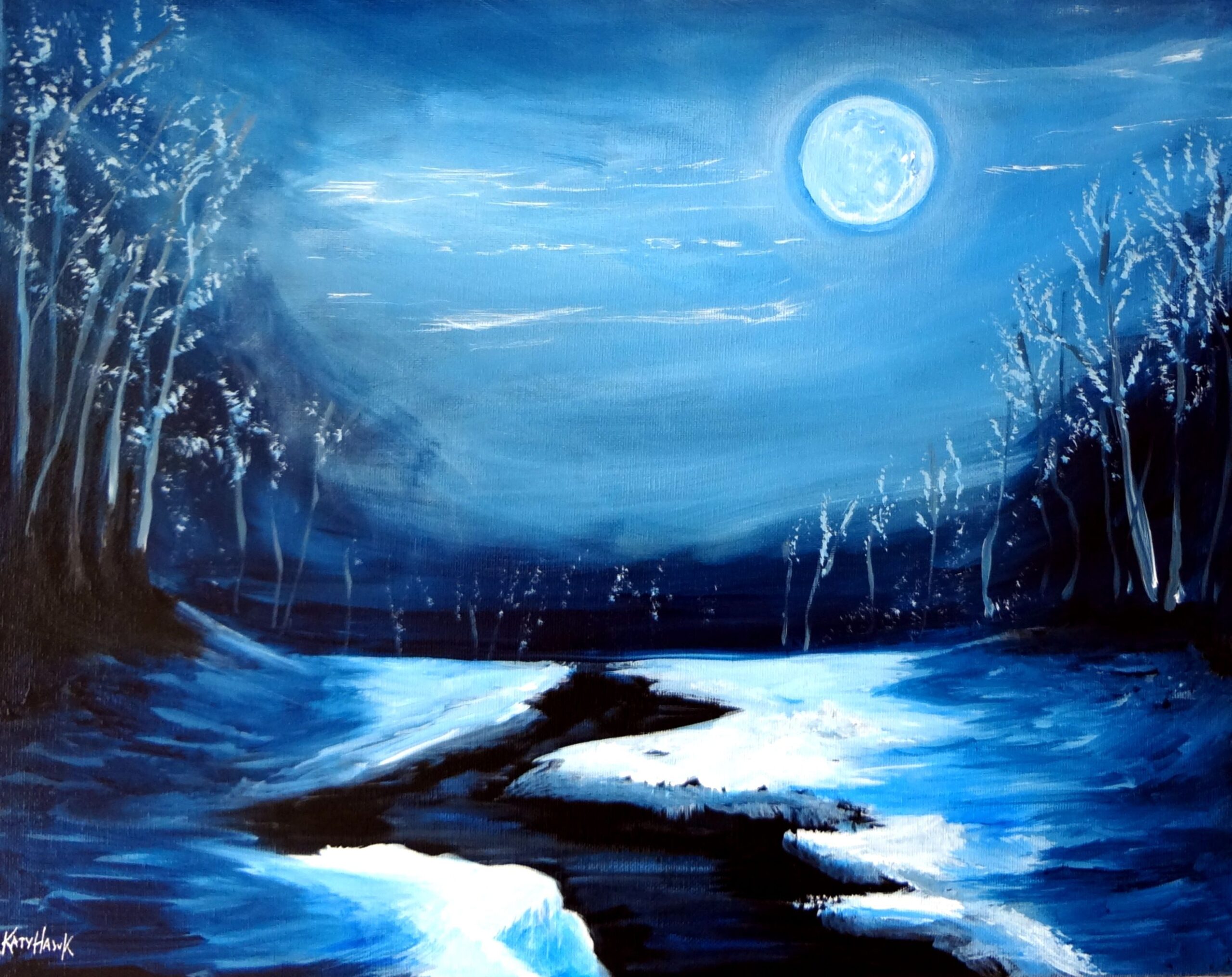
Monochromatic colors refer to the use of a single hue in an artwork, with variations in lightness, darkness, and saturation. Despite the simplicity of using just one color, monochromatic artworks can still exhibit a range of visual effects and emotions. As long as the hue remains consistent, the artwork is considered monochromatic.

For example :

Here are some art using Monochromatic colors

2. Analogous Colours

Analogous colors are hues that are adjacent to each other on the color wheel. When used together in an artwork, they can create a harmonious and calming effect. By selecting colors that are next to each other on the wheel, artists can create a cohesive and visually appealing color scheme.

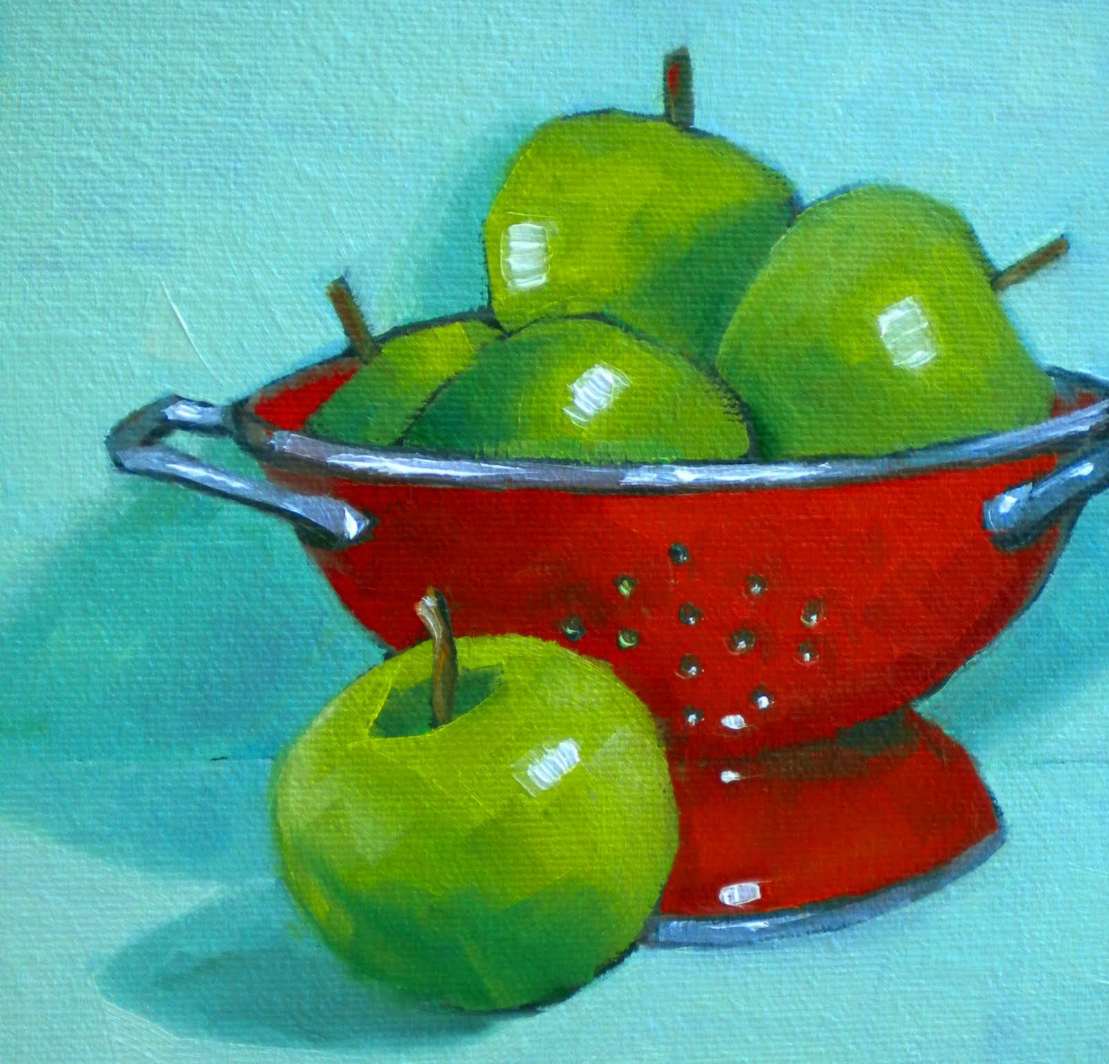
3. Complementary Contrast

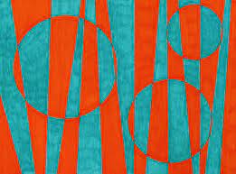
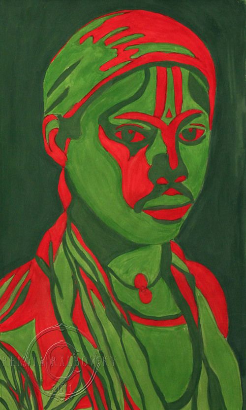
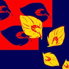
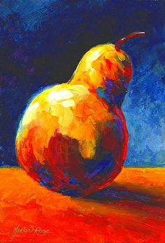
Complementary contrast refers to the concept in color theory where two hues are chosen from opposite ends of the color wheel, creating a strong contrast. This contrast can result in visually striking artworks. However, achieving a sophisticated look can be challenging, as it may easily veer towards a childish appearance.
Complimentary Colors | Contrast art, Colorful art projects, Pear art

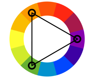
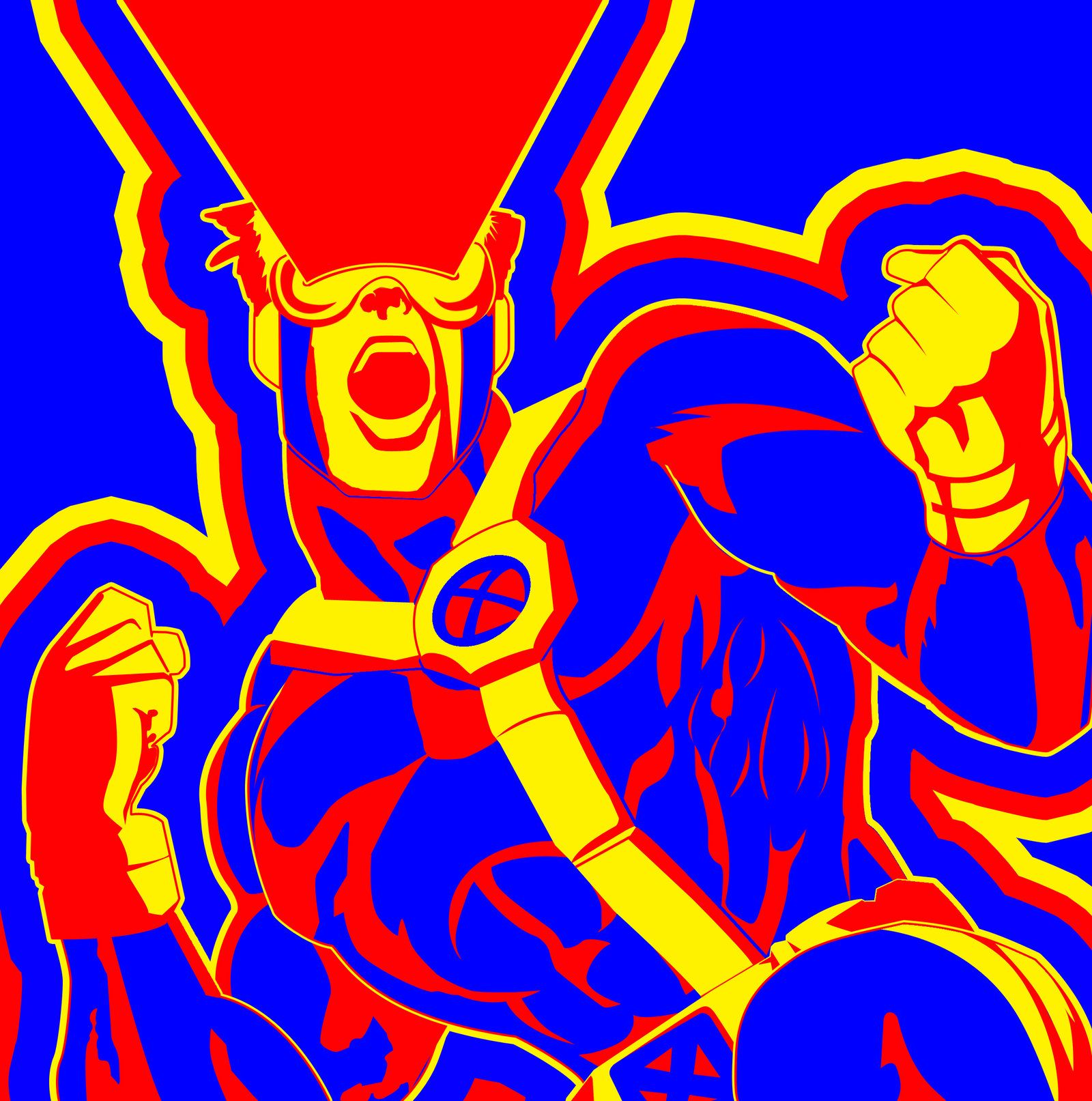
4. Triad Colours

Triad colors are three colors that are evenly spaced out on the traditional color wheel. They create a vibrant and distinctive color palette when used together. A balanced triadic color scheme focuses on one dominant color, with the other two serving as accents. Triadic colors stand out from one another and can evoke specific psychological responses in the viewer.
5. Split Complementary Colours

In color theory, split complementary colors are a variation of complementary colors. Instead of combining two opposite colors, split complementary colors consist of a primary color and the two colors adjacent to its complement on the color wheel. This combination provides a greater contrast than standard complementary colors while avoiding the high contrast and potential clash of complementary colors.

What Are Split-Complementary Colors? Best Ways to Use This Color Scheme -  Color Meanings

Split complementary colors can create visually appealing and harmonious designs, as they offer a good balance between contrast and harmony. They are particularly useful when you want to create a more dynamic and vibrant look compared to using monochromatic or analogous color schemes.

When working with split complementary colors, consider adjusting the saturation and brightness of each color to achieve the desired visual balance and contrast. You can also use a color palette generator tool to help you explore and experiment with different split complementary color combinations for your designs.

6. Tetradic Complementary Colours

Tetradic complementary colors are a type of color scheme that consists of four colors equally spaced on a color wheel. This palette is also known as a double complementary color scheme, as it contains two sets of opposing complementary colors. Tetradic colors can be formed in two ways: the rectangle approach and the square approach.

What Are Rectangular Color Schemes and How Do You Use Tetradic Colors? - Color Meanings

When designing with tetradic color schemes, it’s essential to be cautious and well-planned. Here are some tips to keep in mind:

  • Be careful not to overwhelm the design with too many colors
  • Use one color as dominant and the others as accents to achieve balance
  • Lower the intensity of the accents to create a more unified combination

By understanding the principles of tetradic complementary colors, designers can create stunning and sophisticated palettes that elevate their designs.

Colour Context

What is Colour Context?

Color context in color theory refers to the way colors interact with and influence each other within a design. The context of a color can significantly affect its perceived hue, saturation, and brightness.

Colors in a design can create various visual relationships, such as contrast, harmony, and hierarchy. By understanding color context, designers can create more effective and visually appealing designs.

For example : The 3 red squares inside these three blocks are exactly same color but they appear to be different in different background colors


Color Context - My Site

Colour Context's Factor

There are several factors that contribute to color context:

  1. Adjacent Colors: The colors adjacent to a specific color can influence its perceived hue, saturation, and brightness. For example, placing a highly saturated color next to a less saturated color can make the less saturated color appear more vibrant.
  2. Background Colors: The background color of a design can significantly impact the perception of foreground colors. For instance, placing light text on a dark background can improve readability compared to placing dark text on a light background.
  3. Contrast: Contrast between colors can create visual hierarchy and focus. High contrast can draw attention to specific elements, while low contrast can create a more subtle and harmonious effect.
  4. Cultural Context: Colors can have different meanings and associations across different cultures. Designers should consider the cultural context of their audience when selecting colors for a design.
  5. Lighting Conditions: The lighting conditions in which a design is viewed can affect color perception. For example, natural light can make colors appear more vibrant, while artificial light can alter color temperature and hue.

By considering these factors, designers can create more effective and visually appealing designs that take advantage of color context.

Aerial Perspective

What is Aerial Perspective?

Aerial perspective, also known as atmospheric perspective, refers to the effect of the atmosphere on the appearance of an object as viewed from a distance. Aerial perspective is a technique used to create depth in an artwork. 

This effect can be seen in many landscape paintings, where distant objects appear paler, of lower contrast, and bluer than nearer objects. Aerial perspective is used to create an illusion of depth and convey a sense of distance in a painting.

Aerial Perspective Example

The aerial perspective obviously depends on your Color Context which is your background, which means that blue backgrounds mean blue ariel perspective and green background means green aerial perspective

This phenomenon can be applied to characters as well, creating a more immersive and realistic artwork.

Common Mistakes and Solutions

One mistake beginners often make is using too many different colors all over the canvas. This can make it hard for people to focus and figure out what’s important. Instead, be clear about where you want people to look.

When you’re starting to paint, especially on a computer, don’t be afraid to use dull colors at first. These will make it easier to make your main color and magnets stand out later. Remember, the first layer is just the beginning.

The Painting Process

Painting is a bit like decorating a new house. You have to bring in all the big stuff before you worry about the details. Blocking in colors is like bringing in the furniture, and playing with color is like arranging it to make the room look nice.

If you’re not happy with your painting, don’t worry. It takes time to get it right. Give yourself the freedom to change things until you’re happy.

Practical Exercises

A good way to learn about color is to paint with just one color at first. This helps you focus on making some parts light and some dark to grab attention. Then, add another color and see how they work together.

When you’re using different colors, think about which one is the most important. Then, use other colors to make it stand out. Notice how different colors make people feel and use that to make your painting better.

In the future I hope I can create some exercise for my followers to learn about using colors!

Conclusion

Alright, we talked a lot so I want to summarize what we have discussed. You can look at the image below I have summarized all the important things you have to remember after all what I have written above

Understanding subject color and magnets helps you make people look at the right parts of your painting. Once you know these basics, you can use color to tell stories in your art.

If you want to learn more about color or other techniques, let us know. 

Remember, getting good at color takes time. Keep practicing, and soon you’ll be making art that really grabs people’s attention.

You may also like

Leave a Comment

About Me

Thảo Móm

Thảo Móm

Hello there! I’m Thao, a digital artist and freelancer on a quest to help you unlock your full creative potential and live life on your terms. 

@2023 – Thao.CuteArts, All Right Reserved.

en_USEnglish